You are using an out of date browser. It may not display this or other websites correctly.
You should upgrade or use an alternative browser.
You should upgrade or use an alternative browser.
Broken Glass
- Thread starter Lawson.
- Start date
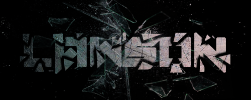
Guardian said:Looks good. I think if it was sharper it would look even better. Maybe its a tad too dark? I prefer darker colors, but with glass you can be too dark.
Nice work though. Keep up the progress, and keep sharing your work!
Thanks for the feedback
Toxique said:Agreed with Guardian, I feel if you would've lighten the text a little more (specifically the LAW) it would look a tad better. Overall though it looks pretty good
Ahhh okay. I see what you mean now. Thanks!
Sharon
Active Member
- Joined
- Apr 27, 2015
- Messages
- 29
- Reaction score
- 7
I LOVE that. I'm curious, did you use font for this or did you manually design "Lawson" in this graphic design? If so, what program did you use? I am really diggin' that broken glass design. It almost seems too dark but I think any lighter might take away from the feel of the image. Great work!
Sharon said:I LOVE that. I'm curious, did you use font for this or did you manually design "Lawson" in this graphic design? If so, what program did you use? I am really diggin' that broken glass design. It almost seems too dark but I think any lighter might take away from the feel of the image. Great work!
Thanks for the feedback! And yes everything was created by me except for the glass image. I use "Photoshop CS6".

